
Page 9 - CUAJFeb2023
P. 9
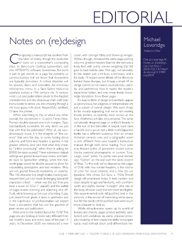
EDITORIAL


       Notes on (re)design                                                                   Michael

                                                                                             Leveridge


                                                                                              Editor-in-Chief
             omposing a manuscript has evolved from   cover, with stronger titles and blown-up images.
             the labor of monks, though the revolution   Within, though, remained the same page-packing   Cite as: Leveridge M.
       Cof casts on a typesetter’s composing     columns, gradient headers that hid title text and a   Notes on (re)design.
       stick, to deliciously clacking typewriters, and   body font with subtly uneven weighting that felt   Can Urol Assoc J
       into WYSIWYG software. Sometimes, the point   past its best-before date. Not ugly, not unwieldy   2023;17(2):7-8. http://
                                                                                             dx.doi.org/10.5489/
       is just to get words on a page for posterity or   to the reader, just a bit busy, a bit heavy, and a   cuaj.8270
       communication, but we know that documents   bit dusty. I’ll explain some details of the decisions
       are typically formatted. A critical checklist will   behind these changes, but it begs a short riff on
       be spaced, clean, and scannable. An old-timey   design (which to me means visual identity, usabil-
       letterpress menu in a faux-faded historical   ity, and aesthetics), how it makes the reader’s
       typeface evokes a 19th century inn. A ransom   experience better, and may mean better know-
       note’s cut-and-paste letters allude to the frazzled   ledge translation from these pages.
       criminal mind, and the ubiquitous chalk craft beer   It’s easy to think of design and aesthetic appeal
       menu wants to entice you into chewing through a   as synonymous, but elegance or attractiveness are
       vile local guava milk stout. Respectfully, landlord,   just a subset of overall design. We want things
       I’ll have the pilsner.                    to be visually appealing, but we’re not making
         When submitting to this or about any other   movie posters, so usability must remain at the
       journal, the convention is 12-point-Times-New-  fore. Aesthetics are also very personal. The same
       Roman-double-spaced-one-inch-margins. Easy,   consciously designed page or artifact’s beauty is
       standardized, accessible. So why don’t we just   in the eye of the beholder. A teapot must have
       stay with that for publication? After all, we sanc-  a handle and a spout, but a sleek matte Japanese
       timoniously muse, it is the integrity of “the sci-  kettle has a different audience than an ornate
       ence” that wins the day, so surely fussing about   Victorian ceramic one, and a calligraphic scroll
       columns and fonts and headers is garnish in the   is very different from your toaster’s instruction
       greater scheme (and isn’t that what they mean   manual, though both serve reading. Your walls
       by “article processing” when they’re asking for   may feature prints of geometric muted colour
       $3000 for open access)? These submission default   blocks, pastoral photography, or cursive “Live,
       settings are geared toward easy review, and hark-  Laugh, Love” prints. I’m pretty sure your kitchen
       en back to typewriter settings, when the real-  says “Gather” on the wall over the table, doesn’t
       world page would be double-spaced to allow for   it? Bless. To this end, we’ve cleaned up the pages
       copyediting annotations and text revisions. They   of CUAJ with less ornate headers, a few blocks
       are not geared towards readability or usability.   of color for visual interest, and a new (to us)
       The 100-character line length makes tracking sub-  typeface. We chose Gill Sans, a 1920s British
       sequent lines just a bit more challenging (about 60   design still prominent today. It feels modern and
       characters is best — when was the last time you   clean despite its age and familiarity, with a uniform
       read a novel on 8.5x11” paper?) and the surfeit   width and slightly shorter “x-height” (the size of
       of pages makes scanning and searching very dif-  the body of lower case) that are smart and legible.
       ficult, while blowing up the cost of printing. It also   We experimented with left-justified text in the
       just doesn’t look great; it lacks in aesthetics and   columns, in the service of maximizing white space,
       in the imprimatur of professionalism we expect   but felt the blocks of full-justified text were much
       from a document that has run the gauntlet of   more pleasant to look at.
       peer review and publication.                While attractiveness opens up its world of
         Welcome to the revised layout for CUAJ! The   tweaks and choices, pages achieve aesthetic satis-
       page you are looking at looks very different from   faction and usefulness via some universal princi-
       last month’s issue, and every issue of the past 15   ples. Usability of text means the ability to navigate
       years. In December 2020, we introduced a new   easily, read without strain, and differentiate ele-


                                       CUAJ  •  FEBRUARY 2023  •  VOLUME 17, ISSUE 2  ©  2023 CANADIAN UROLOGICAL ASSOCIATION  7